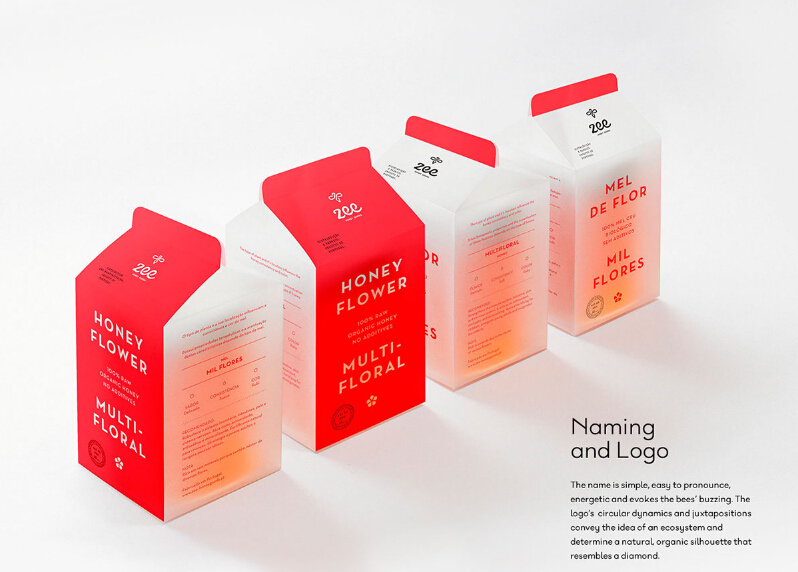
ZEE - HONEY GOODS
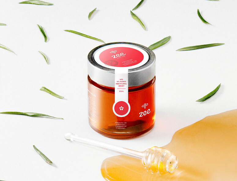
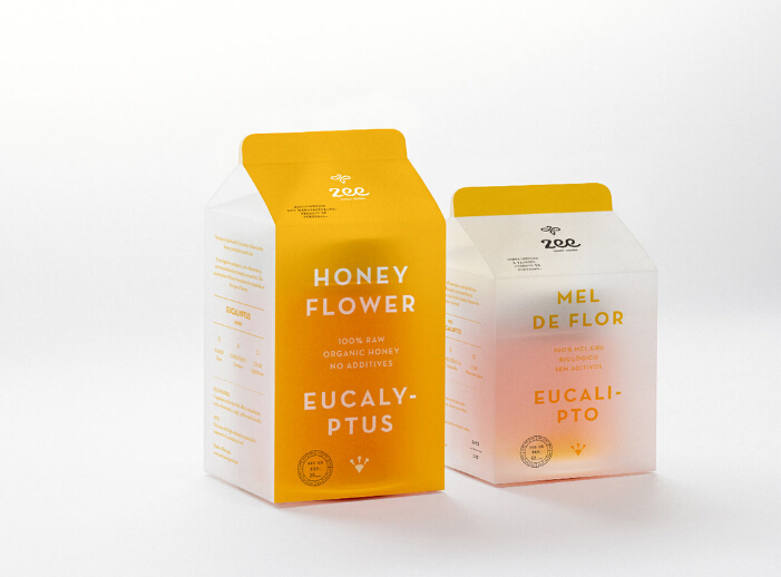
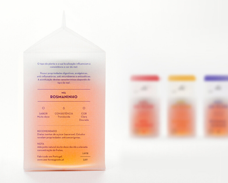
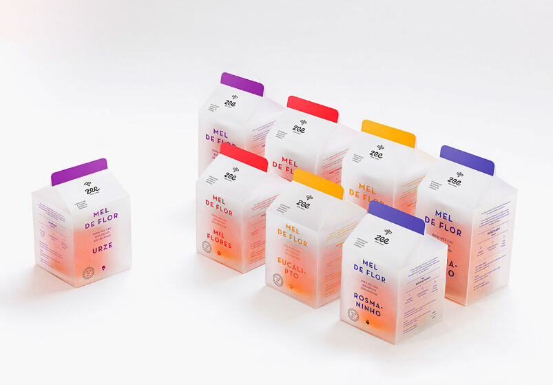
This packaging for Zee- Honey Goods elevates honey to a whole other level I never knew existed. Designed by an amazing group of creatives over at gen design studio, honey collected from several bee hives is poured into glass jars fitted with an aluminum lid for preservation. The jar is then placed inside a milk carton-shaped packaging structure made with frosted paper. The frosted look transforms this packaging into a delicate art piece that will make anyone hesitant to open it for the fear of tarnishing its beauty.
How can a brand convey these values and still embody a sweet identity?
By taking the business’s vision and developing a solid communication strategy, to create a cohesive brand from naming to logo, graphic elements and packaging. "
文章源自 设计联盟 www.DesignLinks.cn 中国最具影响力的创意设计综合网站


